Skip to content
The logo of Vanadium Games
  • Home
  • About
  • Games
    • The Stacks
    • Kedian Interspace
    • Illumination
  • Blog
  • Press Kit
  • Contact
    • Support
    • Game Feedback
The logo of Vanadium Games Blog

The New Logo

  • 09/03/201909/03/2019
  • by Morgan Gray
ShareTweet

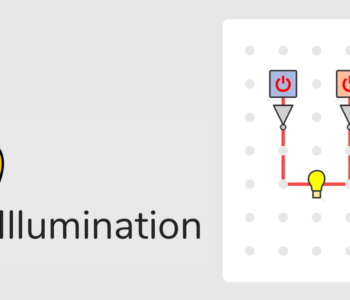
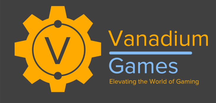
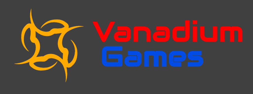
As you may have noticed, Vanadium Games has recently introduced a new logo as we felt that our old logo did not represent our company very well and the red and blue colours were hard to read at a distance.

Our old logo
Our old logo

The inspiration for our new logo began by brainstorming what it should represent: we decided the most important things to signify were the element Vanadium, our namesake, as well as the fact that we make games.

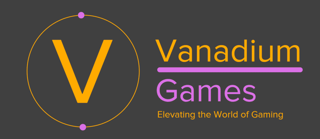
The first idea we produced was a ‘V’ linking to the word Vanadium, encircled by a ring with two dots on it to represent Vanadium’s outer electron shell. We also included our strap line ‘Elevating the World of Gaming’.

The first revision of our logo

After reviewing our logo, we decided that we needed to add something to our logo to represent that we are a games studio. We eventually settled on the idea of using a controller in the centre of the ring. As well as this, we tried adding multiple rings.

The second revision of our logo
The second revision

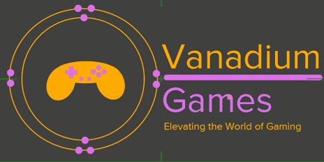
We concluded that the extra ring was too chaotic and the controller didn’t fit our taste as it seemed too generic and stereotypical.

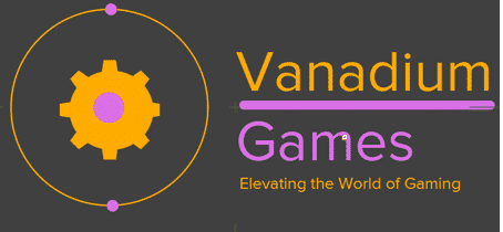
Moving onward, we decided a different game production related symbol. Eventually, we settled on a cog which linked closely to the development aspect of our company.

The third revision of our logo
The third revision

At this point, we were beginning to like how the logo was turning out. Despite this, we still wanted to incorporate the ‘V’ into the logo, so we decided to make the cog the outside of the logo and enclose the rest of the content within.

The fourth revision of our logo
The fourth revision

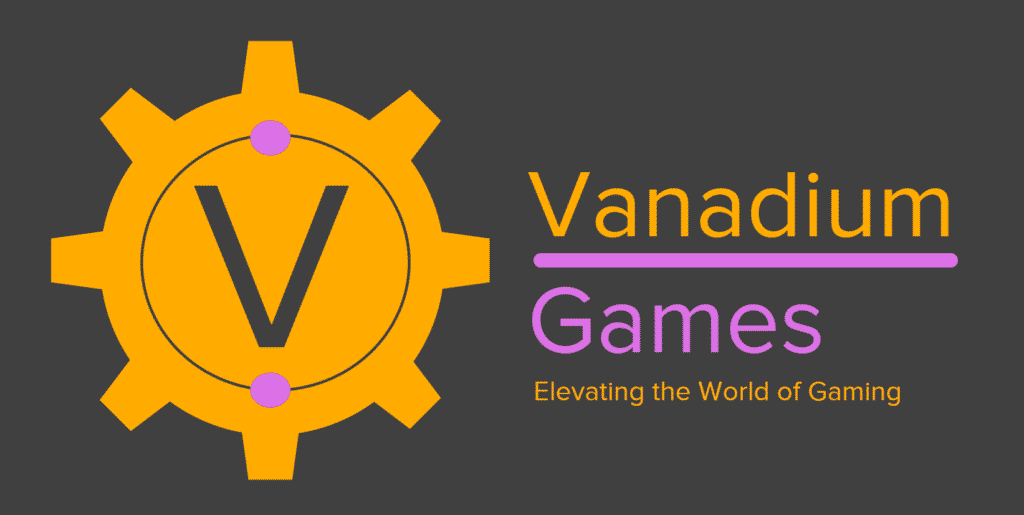
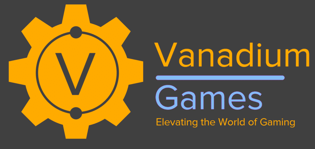
This was the result of our new idea and it was getting very close to something we were happy with. We just had a few small issues, including the size of the teeth on the cog (which were too small) and the fact that the icon consisted of three colours (when most icons today use only two).

The fifth revision of our logo
The fifth revision

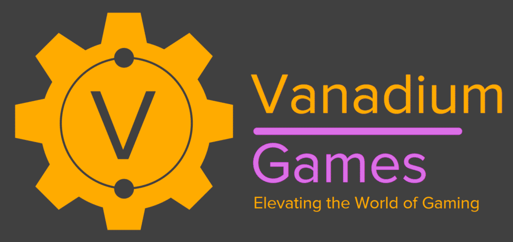
After correcting these small issues, we really liked our design. We decided that changing the purple colour to a different colour could make the logo more vibrant and provide a better contrast ratio to the grey background, making it easier to read.

The sixth revision of our logo
The sixth and final revision

Finally, after making all our amendments, we reached this and are really happy with how it turned out – we believe that the logo represents our company well and is visually appealing. We feel that it is much better than our old one.

Coolest Projects 2019
The Stacks Update 1.0.14
morgang
    Blog Branding Changes Company Logo Update

    Related articles

    Illumination Released
    Illumination Beta Release
    Illumination logo
    Illumination Release
    July/August Newsletter
    An image of fireworks
    Our First Birthday
    An image of the Kedian Interspace Tactical Headquarters Screen
    May/June Newsletter
    An image of a cup of coffee
    mmm… Coffee!
    Josh working on Kedian Interspace
    March/April Newsletter
    Vanadium Games Day
    An image of the App Store Developer screen showing version 1.0.14 of The Stacks
    The Stacks Update 1.0.14
    An image of a child playing The Stacks at our stand at Coolest Projects UK
    Coolest Projects 2019
    An image of the Coolest Projects logo
    Preparing for Coolest Projects UK
    An image of the current prototype of our Tower Defence Game, with placeholder sprites
    January/February Updates
    An image of our Discord server
    Discord Server Updates
    Fireworks showing the year 2019.
    Looking Back At 2018 (And…
    An image of The Stacks on an iPad
    The Stacks Update on iOS
    Autumn Leaves
    Monthly Review – November
    An image of Trolley Dash in production
    Monthly Review – October
    An image of multiple devices playing The Stacks
    The Stacks Update 0.9.21
    An image of a calendar
    Monthly Review – September 2018

    Leave a Reply Cancel reply

    You must be logged in to post a comment.

    The logo of Instagram The logo of Twitter The logo of Facebook The logo of Youtube An image saying Subscribe to our Mailing List
    Tweets by VanadiumGames

    Facebook Feed

    Copyright © 2023 Vanadium Games Ltd

    Vanadium Games Ltd

    Company No
    11517330

    This site is protected by reCAPTCHA and the Google Privacy Policy and Terms of Service apply.

    The logo of Vanadium Games

    Contact

    Email
    [email protected]
    [email protected]
    [email protected]

    Mailing Lists

    Join our mailing lists

    Privacy Policy & Cookies

    Review our Privacy Policy

    Closed Beta Testing

    Click here to learn more

    Social

    • Facebook
    • Twitter
    • Instagram
    • YouTube
    • Discord
    • BandCamp